Mastering Economic Graphs: A Comprehensive Guide to Reading Charts
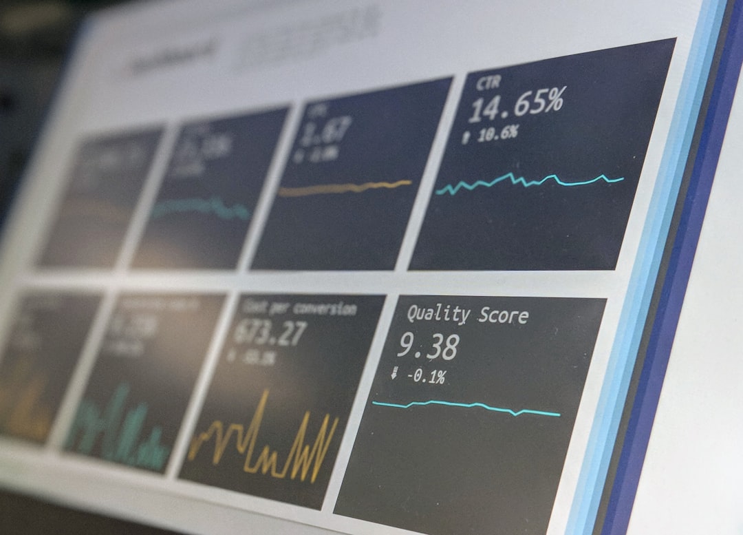
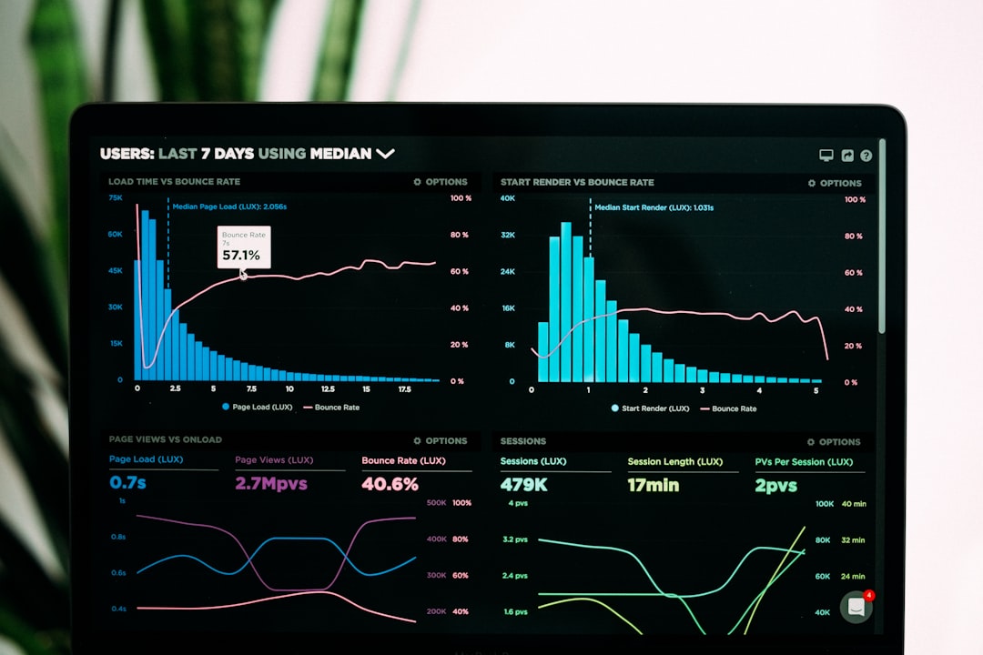
## Introduction. In the ever-evolving world of economics, data visualization plays a pivotal role in interpreting complex information. Economic graphs and charts condense vast amounts of data into visually comprehensible formats, enabling stakeholders—from policymakers to business leaders—to make informed decisions. However, not everyone is equipped with the skills to interpret these visual representations accurately. This guide will help demystify economic graphs and charts, teaching you how to extract valuable insights from various types. ## Understanding the Basics of Economic Graphs. Economic graphs can come in many forms, including line graphs, bar charts, pie charts, scatter plots, and more. Each type serves a unique purpose and is best suited for presenting specific types of data. For instance, line graphs effectively depict trends over time, whereas bar charts are useful for comparing quantities of different categories. Before diving into specifics, familiarize yourself with these common types of graphs and understand their basic structure: the axes, the scale, the legend, and the data points. ### Key Components of Economic Charts. When viewing an economic chart, several core components should be taken into account: - **Axes** - Typically, every chart has a horizontal (x-axis) and vertical (y-axis) axis, each representing specific variables. Economic time series typically showcase time on the x-axis and economic indicators like GDP or inflation on the y-axis. Knowing what each axis represents is crucial for accurate interpretation. - **Legends and Labels** - These provide essential context to understand data subdivisions, colors, or markers used within the chart. This is especially important in multi-series line charts or stacked bar graphs. - **Data Points** - These are the individual data values represented in the chart. They may be dots, bars, slices, etc., depending on the chart type. Ensuring familiarity with these components will enhance comprehension when evaluating economic graphs. ### Analyzing Line Graphs. Line graphs are one of the most common forms used to display changes over time. They typically reflect trends such as economic growth, unemployment rates, or inflation over different periods. When analyzing a line graph, focus on the slope of the lines; a steep upward slope indicates rapid growth, while a downward slope signifies decline. Additionally, try to identify points of inflection—where the trend changes direction. This often provides key insights into economic cycles and potential future movements, making it imperative for analysts and policymakers to understand these trends. ### Insights from Bar Charts. Bar charts are excellent for comparing quantities across different categories. For example, one could use a bar chart to compare annual GDP among various countries or regions. When reading a bar chart, note the length of each bar relative to others, as it indicates the magnitude of each variable. Additionally, check for the presence of grouped bars, which can show comparisons within subcategories. An important aspect of bar charts is the scale on the y-axis; make sure to analyze how the data is represented to avoid misinterpretation. ### Importance of Scatter Plots. Scatter plots are particularly useful for examining relationships between two quantitative variables. For instance, one might use a scatter plot to investigate the correlation between income and education levels. When analyzing scatter plots, look for patterns: positive correlations yield upward trends, whereas negative correlations indicate downward trends. Observe the spread of data points, as this can signify the strength of the relationship; tightly clustered points suggest a strong correlation, while widely dispersed points indicate a weak one. It’s critical to recognize the significance of correlation vs. causation when interpreting these visuals. ## Common Pitfalls in Reading Economic Charts. While interpreting economic graphs and charts can be straightforward, several common pitfalls can lead to misunderstanding. One major pitfall is overlooking the scale of the axes—if the scale is not linear, it can exaggerate or minimize perceived changes. Additionally, be cautious of misleading graphs that emphasize certain data points while obscuring others, often referred to as “cherry-picking.” Lastly, take note of the time frame represented in graphs, as short-term data may not accurately reflect long-term trends. ## Conclusion. Understanding how to read and interpret economic graphs and charts is an invaluable skill in today’s data-driven world. From line graphs that track changes over time to bar charts that compare diverse categories, mastering these visual tools empowers you to make informed decisions based on economic data. Whether for academic, professional, or personal purposes, with practice, anyone can enhance their graph-reading skills and gain insights that drive successful outcomes in various sectors. As you engage more regularly with economic data, remember to apply the principles discussed here to ensure clarity and comprehension in your analytical endeavors. ### Images and Visual Resources. To visualize the concepts discussed in this article better, search for mix graphs, charts, and data visualizations in economic contexts. .